Increase Your Website Conversions
Wondering how to increase your website conversions? Today’s guest, Kayla Dean, is a go to for content writing and copywriting! She is an expert messaging strategist and helps photographers to stand out and show how your business is unique. Keep reading to learn our tips on how to increase your website conversion.
A Pretty Website vs. A Converting Website
Often we find that clients are in a sea of ‘shoulds’. As small business owners it is challenging, but you can absolutely stand out through copywriting and brand messaging. We all struggle with the ‘competition’ mindset, but we don’t let that stop us from running our businesses. From a client’s perspective, ask yourself Why Me? and Why Now? This is Kayla’s magic message for all of her clients.
Use Client Testimonials For Website Conversion
Kayla helped one client get over a dozen new inquiries within a month of launching a new website! She only changed her copywriting and the inquiries were through the roof. Your website should be led by the voice of your client and what your current clients are saying about you.
Don’t fixate or listen to other competition, pay attention to who you are and how you approach your business in a unique way. The best way to do this is to look at client testimonials. Collect as many as you can. There are always patterns within the testimonials.

Converting Client’s Words Into Taglines
Kayla suggests that you should have a process to collect your testimonials. This could be a google form, a google review, or even a client questionnaire in your CRM. Not getting testimonials is hurting your business. In your form or questionnaire, ask things like:
-what was your search for a photographer like?
-what did you like most about the session?
-how was your experience being photographed?
-how did you like receiving your gallery?
A good testimonial will dig deep to help you align your goals in your business. As you collect these testimonials, bold or highlight the repeating phrases or words. This will help you to create a voice of your customer. Pay attention to the vocabulary used to describe your style. You need to be able to speak the language of your customer.
Easy Changes to Make Today For Higher Website Conversions
Use logistical headlines to get your client excited to read your page. Use an attention grabbing headline that encompasses your style, approach, and process. Start your story off on the right foot. Use your SEO keyword after your attention grabbing headline. You want to keep your potential clients scrolling your page and moving onto the next step. This is how you increase your website conversions.

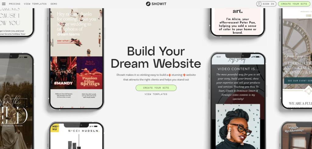
Looking for a place to host your website that is not only designed for creatives, but known for their SEO performance? Look no further than Showit. I’ve been using Showit for over 6 years and I can’t imagine myself using anyone else. Showit makes it so stinking easy to build a stunning website that attracts the right clients and helps you stand out. From their free templates to their resource library, they are top notch. You can grab yourself a free month of Showit by going to brookejefferson.com/showit.
Utilize a Call to Action
Buttons on a website are also known as call to actions. These simply get your potential client to keep moving through your website and encourage them to take a specific action. Your call to action could be as simple as getting them to view your portfolio, view pricing information, or to contact you.
A call to action you want to avoid on your home page is to book with you. Most potential clients don’t have enough information yet to directly want to book a session. Clear copy over cute always wins in your website design. For more tips on marketing yourself, read here.
Increasing Your Website Conversions
Use your testimonials throughout your website and intersperse them into your work. Use specific reviews for specific services. Utilize your testimonials with the context, images, etc.. Show off the voice of your client throughout your website. Hope these tips have helped to give you some easy changes you can implement today for higher website conversions.
